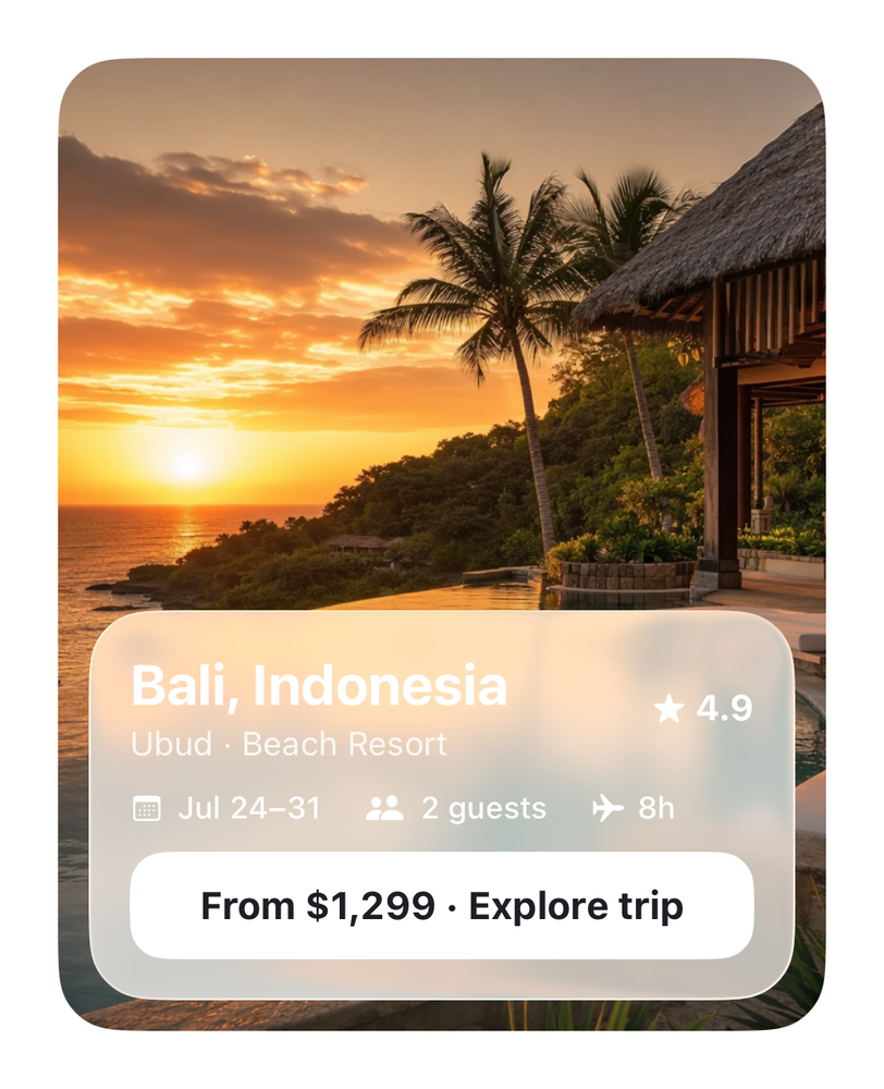
Rendered from the real SwiftUI via ImageRenderer
Destination Hero ✨
NFrom Nibware - Original components, crafted in-house.
A destination hero with a floating Liquid Glass info panel.
Travel34 linesSwiftUIiOS 17+
The actual source
Destination Hero ✨ · SwiftDestinationHero.swift
import SwiftUI

let trInk = Color(red: 0.11, green: 0.12, blue: 0.14)

extension View {
    /// iOS 26 Liquid Glass with an ultraThinMaterial fallback for earlier versions.
    @ViewBuilder func liquidGlass<S: Shape>(_ shape: S) -> some View {
        if #available(iOS 26.0, *) { self.glassEffect(.regular, in: shape) }
        else { self.background(.ultraThinMaterial, in: shape) }
    }
}
Images this component uses
The code references this image by name. Download and drag into your Xcode Asset Catalog, keeping the same name, and the component renders exactly like the preview. Or swap in your own.

What it needs
Self-contained SwiftUI - system materials, SF Symbols, no external dependencies. This screen also references:
All of it - tokens, sub-views, models - is carried in the copy-paste source above.