Rendered from the real SwiftUI via ImageRenderer
Gradient Pro Paywall
NFrom Nibware - Original components, crafted in-house.
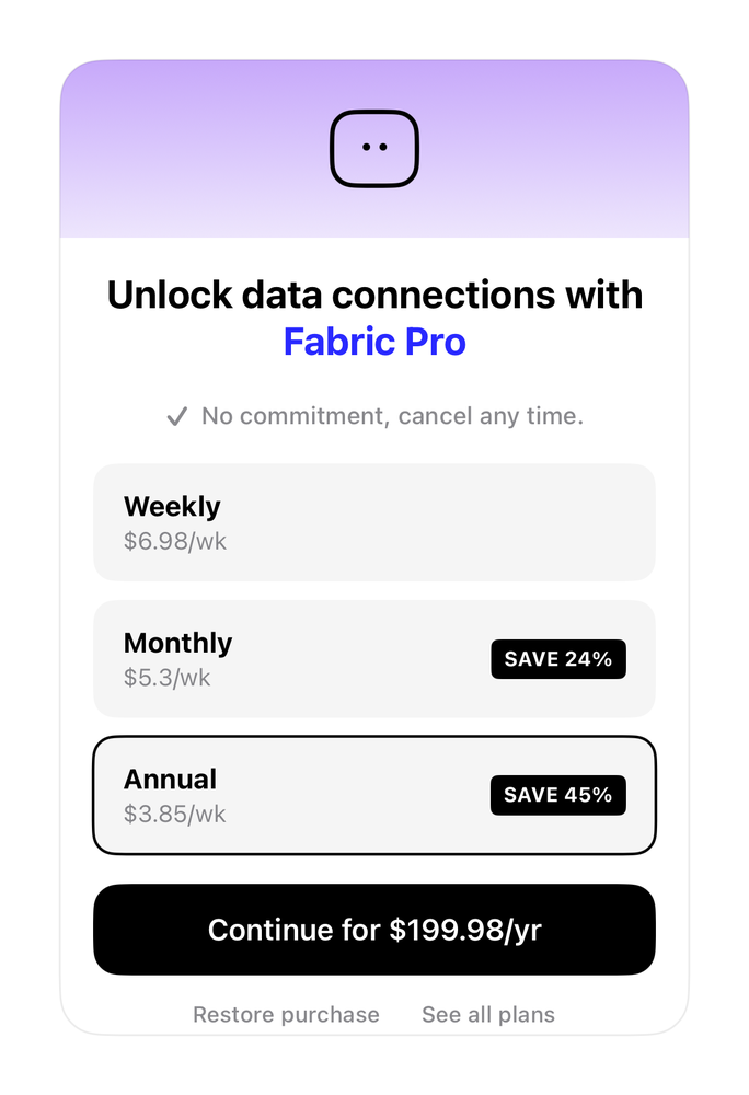
A Pro upgrade paywall with a gradient header and weekly-priced plan rows.
Pricing39 linesSwiftUIiOS 17+
The actual source
Gradient Pro Paywall · SwiftGradientProPaywall.swift
import SwiftUI

func prButton(_ label: String, bg: Color, fg: Color = .white, radius: CGFloat = 12, size: CGFloat = 16) -> some View {
    Text(label).font(.system(size: size, weight: .semibold)).foregroundStyle(fg).frame(maxWidth: .infinity).padding(.vertical, 15).background(bg, in: RoundedRectangle(cornerRadius: radius, style: .continuous))
}

/// Fabric - Pro paywall with purple gradient header and three weekly-priced plan rows.
struct PricingFabric: View {
    let blue = Color(red: 0.16, green: 0.16, blue: 1.0)
    func plan(_ title: String, _ price: String, _ save: String?, _ sel: Bool) -> some View {
        HStack {
            VStack(alignment: .leading, spacing: 2) { Text(title).font(.system(size: 15, weight: .bold)); Text(price).font(.system(size: 13)).foregroundStyle(.secondary) }
            Spacer()
            if let s = save { Text(s).font(.system(size: 11, weight: .bold)).foregroundStyle(.white).padding(.horizontal, 7).padding(.vertical, 4).background(Color.primary, in: RoundedRectangle(cornerRadius: 4)) }
        }.padding(.horizontal, 16).padding(.vertical, 14).frame(maxWidth: .infinity)
            .background(sel ? Color.primary.opacity(0.04) : Color.primary.opacity(0.04), in: RoundedRectangle(cornerRadius: 12))
            .overlay(RoundedRectangle(cornerRadius: 12).stroke(sel ? Color.primary : Color.clear, lineWidth: 1.5))
    }
    var body: some View {
        VStack(spacing: 0) {
            ZStack {
                LinearGradient(colors: [Color(red: 0.78, green: 0.66, blue: 0.98), Color(red: 0.93, green: 0.90, blue: 0.99)], startPoint: .top, endPoint: .bottom).frame(height: 96)
                RoundedRectangle(cornerRadius: 12).stroke(Color.primary, lineWidth: 2.5).frame(width: 46, height: 40).overlay(HStack(spacing: 5) { Circle().frame(width: 4, height: 4); Circle().frame(width: 4, height: 4) }.offset(y: -1))
            }.frame(height: 96).clipped()
            VStack(spacing: 0) {
                (Text("Unlock data connections with ").font(.system(size: 21, weight: .bold)) + Text("Fabric Pro").font(.system(size: 21, weight: .bold)).foregroundColor(blue))
                    .multilineTextAlignment(.center).fixedSize(horizontal: false, vertical: true)
                HStack(spacing: 6) { Image(systemName: "checkmark").font(.system(size: 12, weight: .bold)); Text("No commitment, cancel any time.").font(.system(size: 13, weight: .medium)) }.foregroundStyle(.secondary).padding(.top, 20)
                VStack(spacing: 10) {
                    plan("Weekly", "$6.98/wk", nil, false)
                    plan("Monthly", "$5.3/wk", "SAVE 24%", false)
                    plan("Annual", "$3.85/wk", "SAVE 45%", true)
                }.padding(.top, 18)
                prButton("Continue for $199.98/yr", bg: Color.primary, radius: 14).padding(.top, 16)
                HStack(spacing: 22) { Text("Restore purchase"); Text("See all plans") }.font(.system(size: 12, weight: .medium)).foregroundStyle(.secondary).padding(.top, 14)
            }.padding(.horizontal, 18).padding(.top, 18).padding(.bottom, 4)
        }.frame(width: 340).background(Color(.systemBackground), in: RoundedRectangle(cornerRadius: 22, style: .continuous)).clipShape(RoundedRectangle(cornerRadius: 22, style: .continuous)).overlay(RoundedRectangle(cornerRadius: 22).stroke(Color.primary.opacity(0.08)))
    }
}
What it needs
Self-contained SwiftUI - system materials, SF Symbols, no external dependencies. This screen also references:
All of it - tokens, sub-views, models - is carried in the copy-paste source above.