Rendered from the real SwiftUI via ImageRenderer
Plan Confirmation
NFrom Nibware - Original components, crafted in-house.
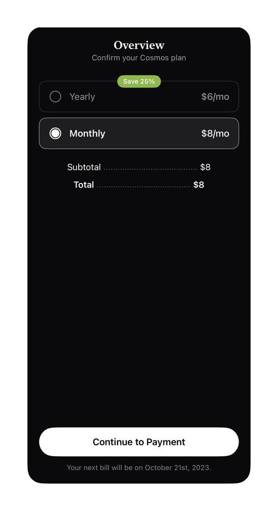
A dark plan-confirmation overview with subtotal and total lines.
Pricing37 linesSwiftUIiOS 17+
The actual source
Plan Confirmation · SwiftPlanConfirmation.swift
import SwiftUI

func prButton(_ label: String, bg: Color, fg: Color = .white, radius: CGFloat = 12, size: CGFloat = 16) -> some View {
    Text(label).font(.system(size: size, weight: .semibold)).foregroundStyle(fg).frame(maxWidth: .infinity).padding(.vertical, 15).background(bg, in: RoundedRectangle(cornerRadius: radius, style: .continuous))
}

/// Cosmos - dark "Overview / Confirm your plan": two radio rows + subtotal/total, light CTA.
struct PricingCosmos: View {
    let green = Color(red: 0.56, green: 0.72, blue: 0.31)
    func row(_ title: String, _ price: String, _ sel: Bool) -> some View {
        HStack(spacing: 12) {
Image(systemName: sel ? "largecircle.fill.circle" : "circle").font(.system(size: 20)).foregroundStyle(sel ? Color.white : Color.white.opacity(0.4))What it needs
Self-contained SwiftUI - system materials, SF Symbols, no external dependencies. This screen also references:
All of it - tokens, sub-views, models - is carried in the copy-paste source above.