Rendered from the real SwiftUI via ImageRenderer
Map Card
NFrom Nibware - Original components, crafted in-house.
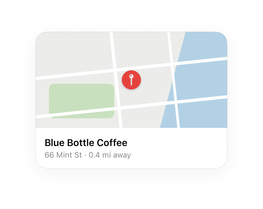
A map thumbnail card with a marker and place name.
Maps45 linesSwiftUIiOS 17+
The actual source
Map Card · SwiftMapCard.swift
import SwiftUI

let mpRed = Color(red: 0.90, green: 0.26, blue: 0.24)

func mpMap(_ w: CGFloat, _ h: CGFloat, _ radius: CGFloat = 16) -> some View {
    ZStack {
        Color(red: 0.925, green: 0.930, blue: 0.918)
        Rectangle().fill(Color(red: 0.70, green: 0.82, blue: 0.90)).frame(width: w * 0.55, height: h * 2.2).rotationEffect(.degrees(15)).offset(x: w * 0.5)
        RoundedRectangle(cornerRadius: 8).fill(Color(red: 0.79, green: 0.88, blue: 0.75)).frame(width: w * 0.34, height: h * 0.36).offset(x: -w * 0.26, y: h * 0.22)
        Capsule().fill(.white).frame(width: w * 1.5, height: 5).rotationEffect(.degrees(-6)).offset(y: -h * 0.12)
        Capsule().fill(.white).frame(width: w * 1.5, height: 5).rotationEffect(.degrees(-6)).offset(y: h * 0.28)
        Capsule().fill(.white).frame(width: h * 1.8, height: 5).rotationEffect(.degrees(84)).offset(x: -w * 0.08)
        Capsule().fill(.white).frame(width: h * 1.8, height: 4).rotationEffect(.degrees(84)).offset(x: w * 0.22)
    }
    .frame(width: w, height: h)
    .clipShape(RoundedRectangle(cornerRadius: radius, style: .continuous))
}

func mpMarker(_ color: Color) -> some View {
    Image(systemName: "mappin.circle.fill").font(.system(size: 30)).foregroundStyle(color)
        .background(Circle().fill(.white).frame(width: 18, height: 18)).shadow(color: .black.opacity(0.2), radius: 2, y: 1)
}

extension View {
    func mpCard(_ w: CGFloat) -> some View {
        self.frame(width: w)
            .background(Color(.systemBackground), in: RoundedRectangle(cornerRadius: 18, style: .continuous))
            .clipShape(RoundedRectangle(cornerRadius: 18, style: .continuous))
            .overlay(RoundedRectangle(cornerRadius: 18, style: .continuous).stroke(Color.primary.opacity(0.06), lineWidth: 1))
            .shadow(color: .black.opacity(0.05), radius: 14, x: 0, y: 6)
    }
}

/// A map thumbnail card with a marker and place name.
struct MapsCard: View {
    var body: some View {
        VStack(alignment: .leading, spacing: 0) {
            mpMap(300, 150, 0).overlay(mpMarker(mpRed))
            VStack(alignment: .leading, spacing: 3) {
                Text("Blue Bottle Coffee").font(.system(size: 15, weight: .semibold))
                Text("66 Mint St · 0.4 mi away").font(.system(size: 12)).foregroundStyle(.secondary)
            }.frame(maxWidth: .infinity, alignment: .leading).padding(14)
        }.mpCard(300)
    }
}
What it needs
Self-contained SwiftUI - system materials, SF Symbols, no external dependencies. This screen also references:
All of it - tokens, sub-views, models - is carried in the copy-paste source above.