Rendered from the real SwiftUI via ImageRenderer
Balance Card
NFrom Nibware - Original components, crafted in-house.
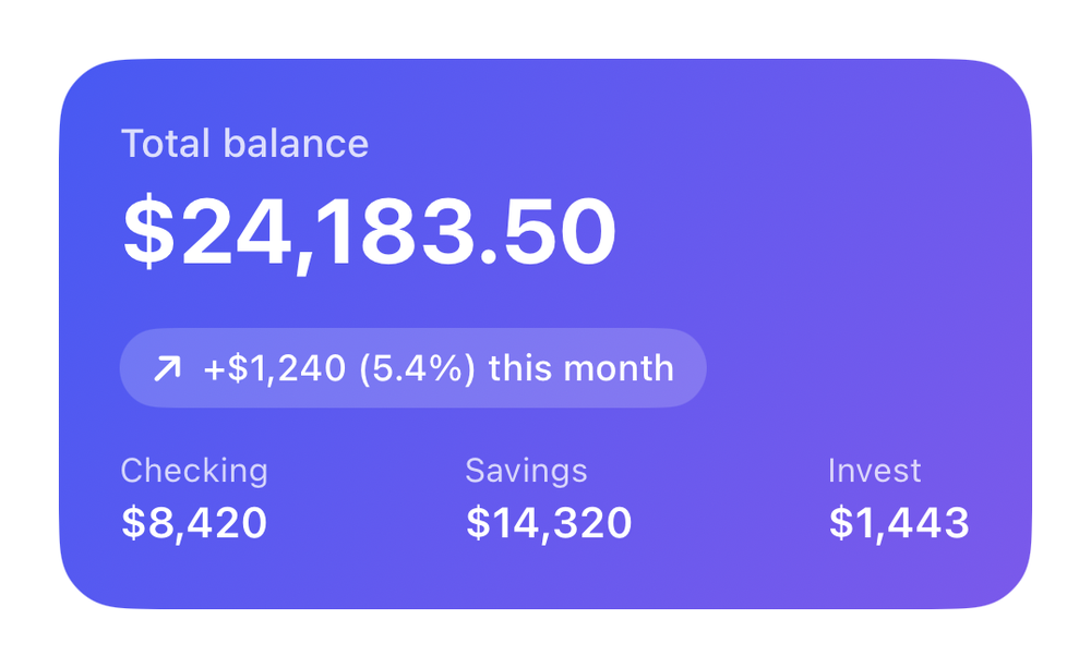
A hero balance card with account breakdown.
Finance29 linesSwiftUIiOS 17+
The actual source
Balance Card · SwiftBalanceCard.swift
import SwiftUI

let fnBlue = Color(red: 0.28, green: 0.35, blue: 0.95)

let fnPurple = Color(red: 0.48, green: 0.35, blue: 0.92)

/// A hero balance card with account breakdown.
struct FinanceBalance: View {
    var body: some View {
        VStack(alignment: .leading, spacing: 14) {
            VStack(alignment: .leading, spacing: 3) {
                Text("Total balance").font(.system(size: 13, weight: .medium)).foregroundStyle(.white.opacity(0.8))
                Text("$24,183.50").font(.system(size: 30, weight: .bold)).foregroundStyle(.white)
            }
            HStack(spacing: 6) {
                Image(systemName: "arrow.up.right").font(.system(size: 11, weight: .bold))
                Text("+$1,240 (5.4%) this month").font(.system(size: 12, weight: .medium))
            }.foregroundStyle(.white).padding(.horizontal, 10).padding(.vertical, 6).background(.white.opacity(0.18), in: Capsule())
            HStack {
                acct("Checking", "$8,420"); Spacer(); acct("Savings", "$14,320"); Spacer(); acct("Invest", "$1,443")
            }
        }
        .padding(20).frame(width: 320, alignment: .leading)
        .background(LinearGradient(colors: [fnBlue, fnPurple], startPoint: .topLeading, endPoint: .bottomTrailing), in: RoundedRectangle(cornerRadius: 22, style: .continuous))
    }
    func acct(_ l: String, _ v: String) -> some View {
        VStack(alignment: .leading, spacing: 2) { Text(l).font(.system(size: 11)).foregroundStyle(.white.opacity(0.75)); Text(v).font(.system(size: 14, weight: .semibold)).foregroundStyle(.white) }
    }
}
What it needs
Self-contained SwiftUI - system materials, SF Symbols, no external dependencies. This screen also references:
All of it - tokens, sub-views, models - is carried in the copy-paste source above.